Project 04 of 12 Design study Interaction design · Community · Product concept
More connection. Less isolation.
Amico
Amico explores how older adults could find people to learn from, teach and spend time with, connecting a mobile community with familiar places and proposed neighbourhood installations.
At a glance
The brief asked how a multichannel experience could support social connection for older adults. I developed design principles, a persona-led scenario and an experience map, then organised teaching, learning, events and connections into an app flow. The proposal links mobile interfaces with public smart-mirror touchpoints, giving the service a presence beyond the screen.
- Context
- Older adults and social connection
- Role
- Research and interaction design
- Channels
- Mobile and proposed public installations
- Outputs
- Principles, scenarios, flows and interfaces
The work, up close
Project artefacts.
06 images · Select to explore
Inside the work · Original product concept · community and skill sharing
Make shared interests and useful activities the entry point to community.
The challenge
Explore how a multichannel experience could support social connection for older adults during the pandemic, across the home and the surrounding neighbourhood.
The reasoning
The experience map centres on teaching, learning, sharing knowledge and meeting neighbours. Those activities give a connection something to grow around, while the design principles support clear and guided participation.
The trade-off
A public installation can create a new point of discovery, but it also adds consent, privacy and access questions. Those are important validation priorities for the proposed service.
01Translate the brief into interaction principles
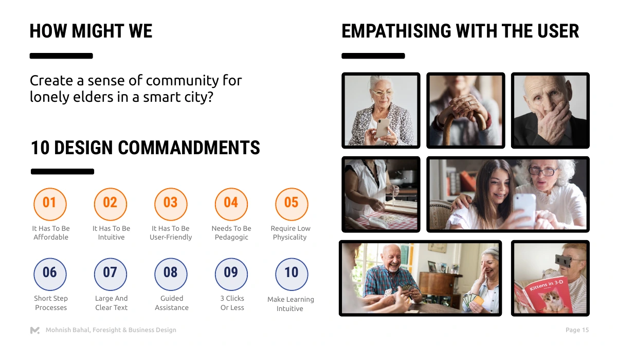
Defined clear text, short processes, guided assistance and low physical effort as design priorities.
Why this direction
The community offer must be approachable across different levels of confidence and ability.
02Connect people through something they can share
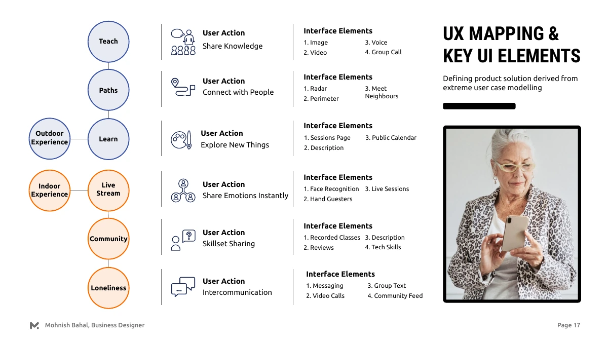
Mapped teaching, learning, local discovery and communication to the channels supporting each activity.
Why this direction
The map connects a social intention to a specific interaction instead of relying on profiles alone.
03Link local discovery with participation at home
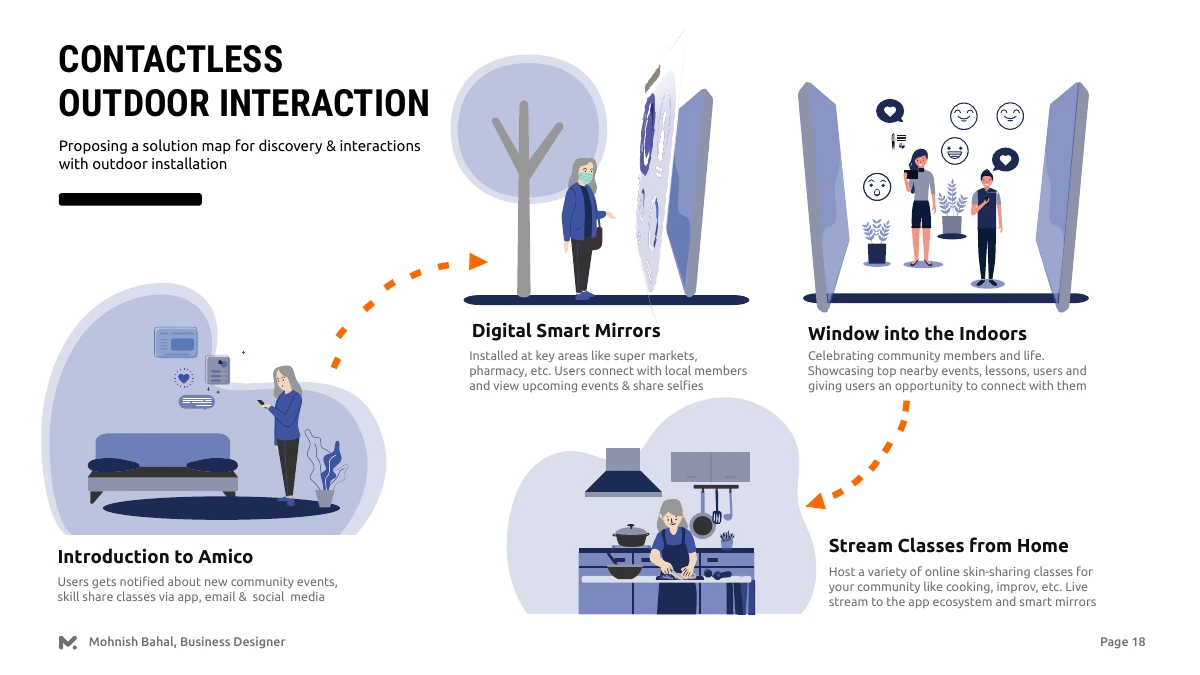
Proposed smart-mirror installations at familiar destinations, connected to events, lessons and the app.
Why this direction
A neighbourhood encounter could introduce the community and create a path into continued digital participation.
04Make the activities visible in the product
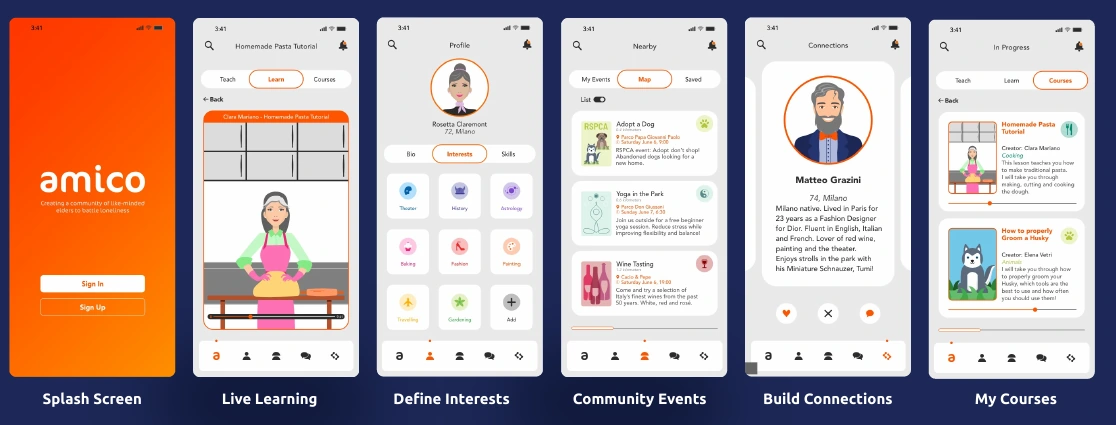
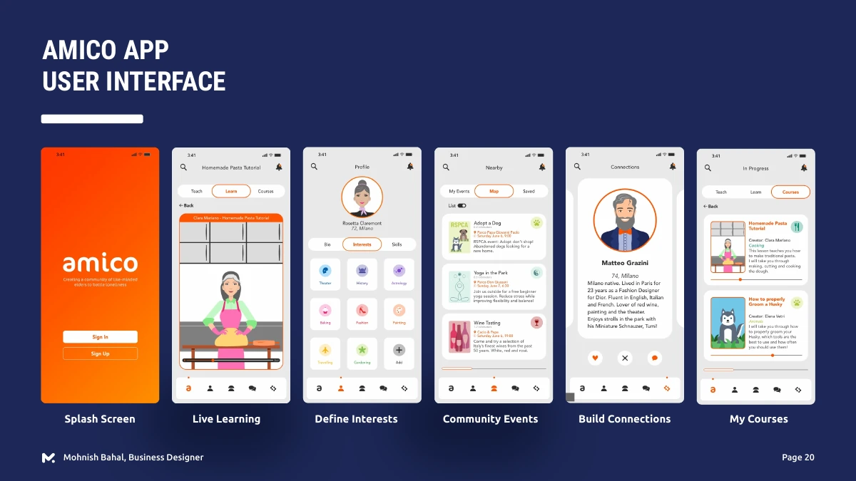
Designed screens for interests, live learning, nearby events, connections and courses.
Why this direction
The interface puts contribution and participation close to the surface, with recognisable activities to choose from.
The challenge
Support connection without defining people by their age.
Amico responds to the social isolation experienced during the COVID-19 period. The brief was to identify problems for older adults in smart cities and propose a multichannel experience that could support community and interaction.
My role covered researching the cohort, identifying problem areas and proposing the experience. A persona and an extreme-user scenario connected the broad social challenge with specific moments of discovery, participation and return.
Design principles
Make participation easier, not smaller.
The study translates the brief into principles including clear text, guided assistance, short processes and low physical effort. Affordability and learnability also appear in the original design-principles board.
The principles give each interaction a purpose: keep the path short, make the text clear and offer guidance when it helps. They create a practical starting point for testing the experience with older adults.
Experience model
Give people something to do together.
The experience map organises the concept around teaching, learning, sharing knowledge, meeting neighbours and exploring local activities. It maps those intentions to channels such as video, voice, group calls, messaging and events.
That keeps the product focused on participation. A community is not only a list of profiles; it needs activities through which people can contribute, find common ground and return.
Across channels
Let the neighbourhood introduce the digital community.
The proposed service includes public smart-mirror installations at familiar local destinations, connected to lessons, events and the app. It explores how a person could encounter the community outside the home and continue participating digitally.
These are concept touchpoints. Privacy, consent, access and the feasibility of public installations would need further evaluation before deployment.
Interaction structure
Connect the invitation to a clear path.
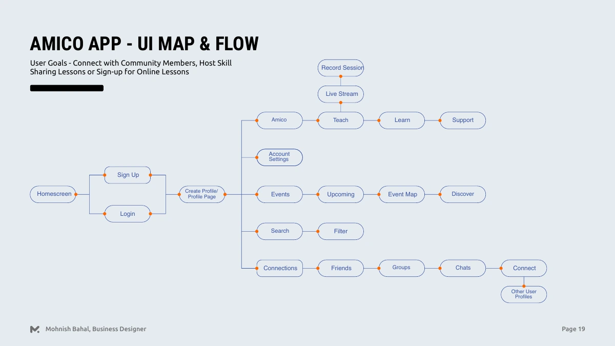
The UI map brings sign-up, profiles, events, teaching, learning and connections into one structure. The interface boards then show interest selection, live learning, nearby events, connections and courses.
Together, the map and screens connect the service idea to a navigable product: discover an activity, choose an interest, meet someone and return to a lesson.
The interface
Make the shared activity the centre of the screen.
The original screens use a warm orange accent, illustration and direct content around lessons, interests and community events. They show people as contributors with skills and interests, not only as recipients of support.
The next validation priority is testing these flows with older adults across a range of visual, motor and digital-confidence needs, particularly the transitions between discovery, joining and participation.
Proposed community service and interface designs, developed through personas and scenarios.